Thursday, May 26, 2022

Just Like The Rainbow

        It was last year I talked about Pride Month being shamelessly exploited by big companies. Well it seems as if they were going to try again with another celebration this year but, hopefully, it's backfired. If you've been looking at the right media, you would of course know that I'm talking about Juneteenth; the observance and celebration of emancipation for enslaved African Americans. Recently, Wal-Mart received backlash for attempting to market a Juneteenth ice cream, nearly a year after the government made it a national holiday.

       Now I know marketing certain holidays isn't new for stores like Wal-Mart, however this does go a bit farther than just using the name. It turns out, holiday names can be trademarked. Credits to Corsearch for the article.

                                                    For more info

       So, if a holiday could be trademarked, and Wal-Mart goes ahead and trademarks Juneteenth, what does this mean? Well, while they can't prevent people from saying 'Happy Juneteenth', this can certainly put a limit on who can use it for marketing. So, if an actual Black-owned business does intend to celebrate Juneteenth in marketing, they might run into issues.

       Again, this is kind of a similar situation to Pride Month. Companies planning on outright piggybacking off an event with more significance than they admit, then trying to market it to the moon and back. However, something different happened  this time, that should hopefully have a positive effect going forward. You see, social media has become an interesting tool in modern times. While back then, resentment was a bit slow to be known, nowadays, we have the information at out fingertips. So, people were thankfully able to vocalize their outrage, and Wal-Mart decided to back out.

          And that pretty much does it for the story. I just wanted to retell it in my words, and kind of share some of my thoughts since it did remind me of the blog I did last year. Hopefully, after this incident, this gets corporations thinking about how they shouldn't keep doing this. Not to say all companies are going to try and exploit the Juneteenth holiday for quick cas; if you know of any that are honestly meaning to celebrate Juneteenth, Pride Month, or any other similar celebration, please support them, I'm sure they'll love it. I just hope that they'll be free of bigger companies making it hard for them. I'm also hoping bigger companies listen more to the minorities they claim to celebrate.

          With that being said, thank you for reading, and stay tuned!


Sunday, May 1, 2022

Clean Up


    Hey guys, so recently, I've felt I needed to clean my portfolio up a bit. Not really too much to say except get rid of some things it didn't need, and have it seem more consistent. Another thing I wanted to note is that I removed a few of my pages. I might not be where I want to be yet as a graphic designer, but I want to fix this up. Hopefully, it's all uphill from here!

    With that, here's a link to the page, thank you for reading, and stay tuned!


Wednesday, April 13, 2022

Bad Advertisement

        So, has anyone else felt like they're tired of a curtain hiding a nice view? I certainly know I can, as sometimes the advertisement for media, clothing, or, anything in general, does a poor job of describing it. From commercials that get annoying way to fast, to poor social media management, to.. Nothing, failing to advertise a product is definitely something you don't want to do in this business. Keep in mind, I'm not talking about a rival company, oh no. I am talking about the advertiser themself, bringing down their own product, whether on purpose, or (most likely), accidental.


Image courtesy of Wikipedia.
    
         Let's start off with the 'This Game Stinks' campaign. For whatever reason Nintendo decided to advertise the game Earthbound by bringing attention to its many smells, even having scratch and sniff elements on the page. Now, one could argue that the 90s, when Earthbound came out, was the gross out era, and that kids would be ok with this. However, I don't imagine many kids having the attention to read below something that says 'This Game Stinks'. I also don't think the gross out elements connected with everyone, but really it's just bad advertising. There are more reasons Earthbound failed to take off with the public eye for so long, but we're not focusing on that right now.


         Another example I can think of is commercials that try to be like a meme. Let's say like this one right here.
    

         This is clearly just Chips Ahoy trying to catch the attention of kids nowadays, with the popularity of the game Among Us. Honestly though, it just feels confusing to me, with line such as; 'miss out on these snacks'. Granted, I am not a child, so I'm not the intended demographic, but then again, I feel this commercial is so basic that not even a child would be interested in getting Chips Ahoy.

        At the end of the day though, any advertisement is better than no advertisement. You never get anywhere if you don't describe yourself well, or put yourself out there. Just make sure that when you do, you don't make yourself look bad, or annoy potential customers. With that said, thank you once again for reading, and stay tuned!


Sunday, April 10, 2022

Stylistic Changes

       So it's not an uncommon sight to see a logo change, or to see an art style for a show look different from when it began. Now, obviously, this could be a byproduct of having new people take over for something. However, this could also just be slight changes and tweaks to one's style after learning more. At the end of the day, style will change in media. Today, this is what I want to talk about.

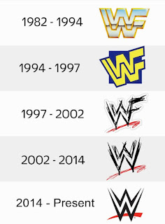
       So, starting off, there's always the fact that people will just want to keep up with the times. Logo changes may signify a transition into a new era, wether it be for personal beliefs, a change in management, or to keep up with the times. I feel a good example would be the WWE logo.

 Image courtesy of logomyway http://blog.logomyway.com/wwe-logo/

      Here you have a good demonstration of keeping up with current trends, and personal events getting in the way. You have the logo going from being a grandiose, trophy like image, to being a bit more fun. Come the Attitude era for WWE, and they make it look more like it was scratched in to appeal to a hardcore audience. Eventually, they drop the F because of a lawsuit from the World Wildlife Foundation, and then clean the logo up a bit. I would actually argue this is one of the few simplified logos done right, considering it makes it seem more business savvy, but it keeps that jagged look people are so familiar with, and makes it look a bit like an award itself.
  
         However, then we get to style changes that fit more into details. Sometimes, certain elements will get taken away to make the art process easier. Still, there are times when more detail is added, say when they get more money to work with. Then again, it might also just be a choice to change how things look in a show as characters age. It really depenfs on circumstance. Sometimes the change in style is, as I stated before, just a result of the previous team or designer leaving, and a replacement stepping in. Sure, they might mimic the style well, but there will always be that element that can't be replaced.

          At the end of the day, nothing is going to stay the same. Even if the changes are so minor, they're still changes. If the decision is to make a logo look like it did before, that's still a change. The style of media will always take a turn towards something else, whether it be good, or bad. With that in mind, let's be more open to change, and pay more attention to when we see it happen. With that said, thank you for reading, and stay tuned!


Sunday, March 20, 2022

Aged Material

       A characteristic of fine wine is age. It gives the flavors in the bottle plenty of time to meet each other and become well acquainted. On the other note, age is also a characteristic of bad milk. You pretty much just have the bacteria growing to the point where it upsets the flavor and texture, making it undrinkable. In a sense, this can apply to the media we consume as well. Whether it be a photo becoming more pixelated from being shared, or a joke in a video that people still enjoy. Age can be both a blessing, and a curse.

          Now, I feel we can all name something  off the top of our head in Graphic design that's aged poorly. For one, the world was unfortunately much less... tolerant of other races. So as a result there are plenty of distasteful propaganda posters, movies, and articles from an era where the people in power were dumb. However, there are also some less offensive examples. Namely, things like old CGI and other effects. 


 Image courtesy of Wikipedia 

          Now, that's  not to say there isn't a charm to certain material with said effects.  However, you can feel that when compared to the CGI of today, things weren't that appealing. Now, in fairness people back then still needed to learn this stuff, and there wasn't that many extra things they could do. So all in all, let it be known that some material hasn't really aged that badly, it just shows its age. Really, it depends on the budget, and how well things were handled.

         What does that have to do with things that age well though? Well, it goes just beyond a correct prediction. Really, all the image, movie, or any media needs is to just be captivate the audience. It doesn't matter the time period, or how it was made, as long as people keep wanting to come back to it, it's aged well. Heck, even the Money For Nothing video I would say has aged well in a way because people like to watch it. What can I say, it's a classic with how weird it is. 

         With that said though, thank you once again for reading! Will this blog age well or not? Well, in order to find out, just stay tuned!


Sunday, February 27, 2022

About the World

       Originally, I was going to talk about something else today, but I feel it necessary to say this here and now. My heart goes out to those in Ukraine who are suffering right now. What is going on is downright terrifying, and I don't know when it will end. I also don't know what will happen to other countries in the future, or if this I'd the start of something crazier.

        Honestly, it feels like recently things just keep crumbling around us. You may look at your phone, your TV, or worse yet, out your window to see just things fall lower. Then the next thing you know, they're asking you to leave home for whatever reason. I don't know how qualified I am to be saying this stuff, or if anyone's paying attention, I just needed to write this down.

         If for some reason you do come across this, then please donate to the Ukainian people. They'll need anything they can get. See what you can do to help in anyway, please! The world may be scary, but we just need to stand together and be brave. 


Sunday, February 13, 2022

Delivering the Message

        When it comes to graphic design, one of our most important jobs is to deliver a message. Whether it be an advertisement, a political statement, or just a joke. However, it's important to understand that we might not have what it takes to send the message. Not to say we are incapable, but there are certain factors to understand. For example, I just made a post about my less than stellar thoughts on NFTs. Therefore if I started advertising NFTs, and someone were to find that post, it would feel like I was selling out. So it goes to show, just because you have the ability to do it, doesn't mean you're the right person to get the point across.

        My reasoning for this is because when Covid made everything suck in 2020, celebrities tried (and failed) to raise spirits.... I guess. Look, I don't want to rag on these guys too much, I'm sure they had good intentions. I just also think that people in luxury singing about a world with no possessions isn't going to make me feel better. The point I'm trying to make is, what they wanted to give us didn't feel right. Sometimes, just because you can, does5mean you should.

     Now, who do I think did this job better than all the celebrities? Well... a frog puppet.


         Now, yes Kermit is somewhat famous, (depends on who you ask), and yes he is owned by Disney. However, Kermit isn't trying to relate to us, or trying to make us feel like we're on the same level. He's simply just... Singing a song about finding your dreams. One he's sung before, but sometimes we just need that message brought up again to help motivate us. The video doesn't have make you feel like your being talked down to, yet it also relates to you in the simplest way.

        Maybe I'm reading a bit too much into it, but I feel this video with a Muppet does a better job of getting a positive message across than most. It probably helps that the message is handled in a certain way; so it is probably important you know what to say before you deliver a message as well. However, I still believe that the right way to handle the message delivery is to be the right person for the job. So before any of you wish to express yourself in any way, be prepared to be the right person to do so. Once again, thank you for reading, and stay tuned!

Wednesday, January 26, 2022

Inclusiveness and M&M's... I Guess..


 Image courtesy of Mashed


         So apparently, the Mars Candy Company has decided the M&M characters need to be redesigned to be more inclusive... Ok. Honestly, after looking at the redesign being a change of shoes, I really don't feel this is such a big deal. Now, if their are commercials that follow this which explores the characters dealing with inclusiveness, such as mental struggles, race, etc., then maybe I could see why. However, it was just the shoes, so... Why am I even talking about this!? Well, keep reading to find out!

         In a way, I would argue that Mars is just trying to either 'get with the times' or 'get attention'. Again, the redesigns are fairly minor, and only to the female M&M's. I can understand both arguments where on one hand, this campaign is probably being ran by people who are just a little out of touch. On the other hand, people have tried to 'act' inclusive to get cash before. At least this time I will say it doesn't feel scummy, just a little overblown.
  
          That's honestly just how I think people's reactions to this have been anyway. This doesn't need to be trending on Twitter, it doesn't need to be a main issue, it's just all overblown. At the end of the day, it's a simple design change so far. I guess it does bring up the argument of, 'what counts as big news.' Which is ideally the topic I wanted to discuss here. I understand that the change to the characters would need to be public for the company to move forward x but the way they worded it was superfluous. Then again, so is the reaction it, and any other minor change could have if it was presented right.
 
     At the end of the day, let's leave on this question. Will the Mars Company show more ways to show the M&M characters as inclusive, or will this be it? At the end of the day, let's just stay tuned!


Sunday, January 16, 2022

My Thoughts on NFTs


             Ok, it's time for me to talk about a subject with a bit of controversy. If you read the title, then you know it's gonna be a rant on NFTs. First of all, let me clarify I know very little about Cryptocurrency. Given that NFTs work in a similar fashion, and the two go a bit hand in hand, I felt it best to state this. This blog is going to be based on what I've seen, and my feelings. Keep in mind, I'm probably not the best person to talk about this, but I wanted to get this off my chest.

       So, starting off, what is an NFT? Well, it's really just any form of data, say a gif, jpeg, png, that can be swapped out for something else. It's not a picture of an Ape making a bored expression, and wearing some goofy clothing. With that in mind, it's clear that the Bored Ape Yacht Club, the group behind those NFTs, have become so popular that they've been forever associated with the acronym. Now the way those images are made is a bit interesting, but let's not get too off track here.

         Now, while the ape I made for this blog is clearly not one of those, I like to think the actual BAYC NFTs are alright..... the first few times you see them. After that, it's just the same 'wacky' auto-generated ape face with a different feature. To add to that concern, these things cost apparently around over $100,000.... No thank you. Of course, there have been other blows to the reputation of NFTs. Environmental damage, the poor attitude of some NFT defenders, and the fact commissions for digital art have been done fine for years without Crypto. On top of that, the image itself you get becomes just another file on the Internet if you post it. At that point, it becomes free for anyone and everyone. 

         That in turn leads me to my final point: thievery. It has become common practice for companies to steal someone else's art, and have it be turned into an NFT available for purchase. Not only does this go against the artist already making it available in the first place, but it also hurts their way of getting attention and proper payment. So all in all, NFTs definitely have a negative stigma around them. One so that I could see someone not associating with them so as to sabe their reputation.

       Conclusion

              What about me though? Now that I've had my big rant, how do I feel? Well, given the reasons stated above, I think I would rather not associate myself with something I find needless, and so controversial. Again, I'm not trying to persuade you of anything, just stating my opinion. At the end if the day, I hate the practices of the people behind NFTs more. However,  I still don't care for NFTs.Who knows, maybe I'll change it if things with NFTs change. I don't know if it will happen, but I guess we just gotta stay tuned!


Sunday, January 2, 2022

Happy New Year

        Hello everyone, and happy New Year! Honestly, not much for me to really talk about this week. I already gave you the run down during Christmas time. Haven't really done anything else due to the holiday break. No real topics I want to talk about yet. All in all, I'm very sorry, but this will be more of a quick post. I just have nothing to talk about, but hopefully I'll have more to discuss soon. Until then, stay tuned!

Friday, December 24, 2021

Happy Holidays 2021


           So, the year is now coming to an end. I would say I've had some accomplishments along the way. Sure, I'm not saying I couldn't have done some things differently,  but I'm still improving. I'll always be improving, and I'm sure you reading this will too! With that said, I just wanted to share some words.

             First off, I just want to thank those of you who have stuck around with me this long. I truly value the fact you care to look at these.  I would also like to welcome anyone new who's come over and began to read. I promise to do my best to keep you entertained and informed. 
   
            Finally, I want to talk about the future here. I do plan on doing more in graphic design. Whether that is freelance or internship work, I don't know yet, but I plan on doing as much as I can. Next, of course we'll have Road to Wrestlemania on my Instagram account, un_dusted9, so check that out! Lastly, I will still keep doing the blogs every other week, so keep a look out for those. 

          With all of that said, thank you so much for reading! Be sure to comment below, share your thoughts, and stay tuned. Make sure to have a very Merry Christmas as well!


Sunday, December 5, 2021

The Fuss About Fonts


          For Graphic Design, you will find yourself using words most of the time. Yes, you can always convey thoughts through images, but words are always straightforward.  It gives people an easy way to get as much information as possible. However, you can't rely on just words alone, you need the right font! A font is a collection of characters with a similar design. (TechTerms.com, https://techterms.com/definition/font#:~:text=A%20font%20is%20a%20collection%20of%20characters%20with,to%20add%20a%20unique%20style%20to%20the%20text.)

             Now, the reason font is important is that it can help the words convey the message you want to give. Either that, or you need it to match the product or program that you need to present. An example would be the font I'm using for this blog. It is simple, and easy to read, so you'll find it used for books, menus, and most any form of written works. That said, it is possible to grow it, make it bold, or italicize it in prefer to convey a certain importance.
        
           However, font consistency is very important when it comes to kerning and tracking. The space between your letters can get easily messed up, and for a non-discernable message if you don't pay attention.  You also need to be aware of things like font sizes, the space between lines in a paragraph, color, and readability.  As such, it's an important task that when using the selected font, you make sure it matches the style in a precise manner.

          Now I could honestly go on and on about this for awhile but I don't want to make this post to long. Once again though, thank you so much for reading! Be sure to comment your thoughts below, and stay tuned!


Thursday, November 25, 2021

Thanksgiving Photography 3

        Another year come and gone. Some things have changed, some are still the same, but I still have to do my pictures. Not that I am complaining mind you.  Anyways, with that being said, here we go.


    Once again, hope you had a Happy Thanksgiving,  and here's to a brighter tomorrow.