So it's not an uncommon sight to see a logo change, or to see an art style for a show look different from when it began. Now, obviously, this could be a byproduct of having new people take over for something. However, this could also just be slight changes and tweaks to one's style after learning more. At the end of the day, style will change in media. Today, this is what I want to talk about.
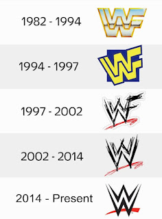
So, starting off, there's always the fact that people will just want to keep up with the times. Logo changes may signify a transition into a new era, wether it be for personal beliefs, a change in management, or to keep up with the times. I feel a good example would be the WWE logo.

Image courtesy of logomyway http://blog.logomyway.com/wwe-logo/
Here you have a good demonstration of keeping up with current trends, and personal events getting in the way. You have the logo going from being a grandiose, trophy like image, to being a bit more fun. Come the Attitude era for WWE, and they make it look more like it was scratched in to appeal to a hardcore audience. Eventually, they drop the F because of a lawsuit from the World Wildlife Foundation, and then clean the logo up a bit. I would actually argue this is one of the few simplified logos done right, considering it makes it seem more business savvy, but it keeps that jagged look people are so familiar with, and makes it look a bit like an award itself.
However, then we get to style changes that fit more into details. Sometimes, certain elements will get taken away to make the art process easier. Still, there are times when more detail is added, say when they get more money to work with. Then again, it might also just be a choice to change how things look in a show as characters age. It really depenfs on circumstance. Sometimes the change in style is, as I stated before, just a result of the previous team or designer leaving, and a replacement stepping in. Sure, they might mimic the style well, but there will always be that element that can't be replaced.
At the end of the day, nothing is going to stay the same. Even if the changes are so minor, they're still changes. If the decision is to make a logo look like it did before, that's still a change. The style of media will always take a turn towards something else, whether it be good, or bad. With that in mind, let's be more open to change, and pay more attention to when we see it happen. With that said, thank you for reading, and stay tuned!


